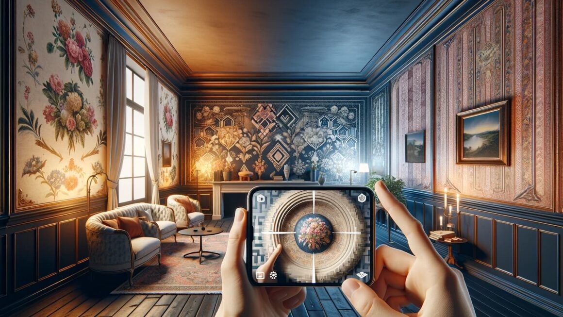
Using more than one wallpaper pattern can give a home character, but it can also make connected rooms feel restless. The solution is to decide where the eye should focus and how each wall relates to the next space.
Instead of choosing every wallpaper separately, treat the home as a sequence of views. A pattern seen from the hallway affects the living room, and a dining area may remain visible from the kitchen. Planning those connections creates a more deliberate result.
Map the Sightlines First
Stand at the entrance of each room and note which walls are visible. These sightlines need the strongest coordination.
A bold botanical wall in the dining area may work beautifully, but another large-scale print opposite it can create competition. A quieter texture, narrow stripe, or painted wall gives the main pattern space to lead.
Create a floor plan and mark:
- the first wall seen from each doorway;
- walls visible from two rooms;
- areas with strong natural light;
- surfaces partly hidden by furniture;
- places suitable for a focal point.
This map separates important walls from background surfaces and prevents paper from being used where the design will be covered.
Give Every Pattern a Role
Patterns are easier to combine when they perform different jobs. One can be dominant, another supportive, and a third neutral.
The Statement Pattern
This is the design noticed first. It may use a large floral, mural, geometric form, or high-contrast color. Limit it to a wall or zone that deserves attention.
The Linking Pattern
A linking wallpaper repeats one or two colors from the statement design but uses a smaller scale. It can appear in a hallway or adjoining room to create continuity.
The Quiet Layer
Textured papers, soft stripes, and low-contrast motifs behave almost like painted surfaces. They add depth without demanding equal attention.
This approach allows variety without making every room compete.
Test Color Across Real Light
A wallpaper sample can look balanced in a shop and completely different at home. Morning light may cool a gray background, while warm lamps can make metallic details more noticeable.
Attach large samples to the intended walls and leave them for several days. View them from adjoining rooms as well as up close. A combination that works within one room may feel disconnected through an open doorway.

Rather than matching every color exactly, repeat a family of tones. A muted green in one pattern can return in upholstery, artwork, or a smaller print elsewhere.
Use Scale to Create Breathing Room
Two patterns of similar size often fight for attention. Pairing a large motif with a small repeat creates a clearer hierarchy.
A wide botanical design can sit beside a fine stripe, while a bold geometric paper may be balanced by a subtle woven texture. The contrast in scale allows each surface to remain distinct.
Large patterns can feel dramatic in spacious rooms, while tight repeats may suit compact walls or narrow passageways.
Balance Pattern With Plain Surfaces
Not every visible wall needs decoration. Painted areas, woodwork, and simple fabrics give patterned surfaces room to stand out.
These quieter elements also make updates easier, because accessories can change without requiring a complete redesign.
Neutral flooring, understated curtains, and uncluttered furniture can support this balance. The goal is not to remove personality, but to create visual pauses between stronger features. When pattern is concentrated in selected areas, the room feels more intentional, comfortable, and flexible enough to adapt as tastes and needs change gradually.
Make Transitions Feel Intentional
Where one wallpaper ends matters as much as the pattern itself. Door frames, corners, paneling, and changes in ceiling height create natural stopping points.
Avoid ending a bold print in the middle of an exposed wall unless trim clearly defines the boundary. In open-plan rooms, wallpaper can mark a dining zone, reading corner, or workspace without a physical partition.
The final interior should feel connected rather than identical. When sightlines, pattern roles, color, scale, and transitions are planned together, each room can have its own personality while still belonging to the same home.